“5 Annoying Trends That Make Every Movie Look the Same”
From Cracked:
Hollywood: the dream factory, the place where joy is made and everybody craps rainbows and cocaine. But underneath the glitz is a bunch of working stiffs who are either just trying to get the job done, or hacks who get their original ideas by ripping off other hacks.
Here are two examples from the article:
#5. Movies are Color-Coded by Genre

Have You Ever Noticed:
There’s some unwritten rule that horror movies should be blue:

The Ring

Saw
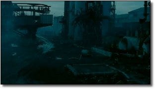
The Nightmare on Elm Street reboot.
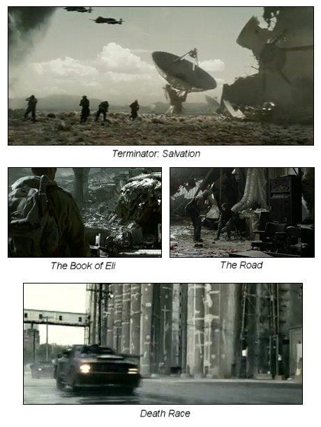
Meanwhile, apocalyptic movies are gray and washed out:
Then there are more subtle ones, for instance movies set in the desert tend to be yellow. And we don’t mean when they’re out in the sun and sand, either. Even when indoors it’ll often look like it was filmed through a jar of urine:
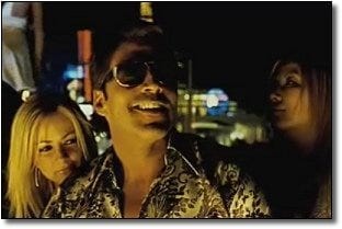
Smokin’ Aces (Las Vegas)

The Hills Have Eyes (rural Nevada)
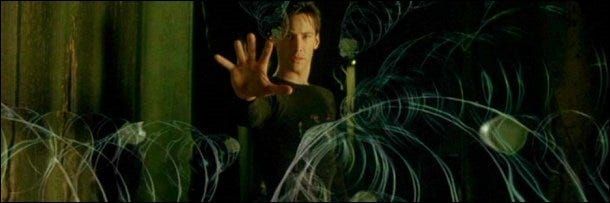
Movies where reality is off-kilter will be green:

Fight Club
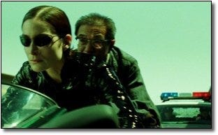
The Matrix films, aka The Greenest Movies Ever Made
Honestly, half the time you can guess the genre of the film based on one still from the trailer.
What’s Going On?
It’s called digital color correction. Back in the day, if you wanted your movie to have an artistic, stylish color palette, you had to go through the pain in the ass process of using filters on your lights and camera, or get the footage exposed just the right way. It was expensive, it was difficult and it was limited to people who really knew what they were doing. So if someone took the trouble, it meant they had a good reason, dammit.
Now? If you’re a Hollywood director, with a few clicks of the mouse you can immediately look stylish and artsy by making the audience feel like they’re watching your movie through a pair of novelty sunglasses. Hell, if you’ve got a Mac and a thousand bucks, you can get a color-correction program and give your home movie of a toddler farting on a cat an otherworldly green tint.
The Coen brothers didn’t invent it, but Oh Brother, Where Art Thou was the first movie to heavily use digital color correction, to the point that every frame was digitally colored to give it that old-timey sepia tone.

But where the Coen Brothers were creating a unique and distinct look, other directors have realized these colors are a no-cost way to create atmosphere without, you know, having to write a good script or hire competent actors. These colors are a visual shorthand for various emotions and ideas (yellows seem hotter, blue makes a scene seem lit by spooky moonlight, washed-out grays are depressing). In other words: It’s just laziness.
And while we’re on color…
#4. Everything Else is Teal and Orange
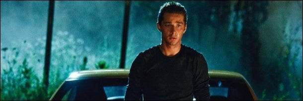
Have You Ever Noticed:
Just like an early 90s parachute pants designer, movies lately have decided the only two colors they need are teal and orange. As some very sharp-eyed bloggers have pointed out, it’s usually unnaturally orange-tinted skin tones against blue skies:


Or against dimly-lit rooms with the bluish tint:

Or whatever orange special effect they can splash against a teal or blue background:


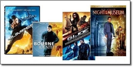
As others have noted, you don’t even need to look beyond the posters:
What’s Going On?
Not everybody wants to get fancy with that their digital coloring. But everybody wants to get lazy.
This is a color wheel:
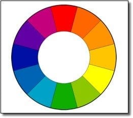
You’ve almost certainly seen one before. Open up your image editing program, it’ll have a version of it. It has all of the colors based on how close they are to each other in hue. Now the goal, if you’re trying to shoot a nice-looking scene, is to get a good contrast with the colors. Since most movies are about humans, you simply find the closest thing to a human’s skin tone on the wheel (somewhere on the upper right) and then make everything else the opposite, most contrasting color (that is, the color on the opposite side of the wheel, or lower left). Teal and orange.
From the beginning of color film, movies have been trying to set up shots to take advantage of this color combination whenever possible. But here in the era of easy digital color correction, they’ve taken this so far that you get that ridiculous two-color system, where every room is bathed in blue and every human looks like he has a bad spray-on douche-tan.
To be fair, it’s not necessarily laziness per se. Your average colorist has to grade about two hours of movie, frame by frame sometimes, in the space of a couple of weeks. It doesn’t take that many glances at the deadline bearing down on the calendar before you throw up your hands and say, “Fuck it. Everybody likes teal and orange!”
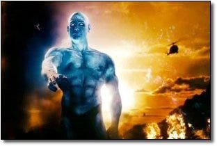
How about you? Sick of Hollywood movie color schemes? Have you noticed any other trends along these lines?
For more of the Cracked article, go here.
Comment Archive